A fanciful history of web design might start with scribes in an ancient Near East civilization, all of them dutifully impressing their clay tablets deeply enough to make the characters easily legible. One day, either intentionally or because of laziness or weariness, one scribe made shallow impressions for his characters, and instead of his fellow scribes rebuking him, they hailed his genius. They were probably hipsters, who seek conformity in their nonconformity, and for whom a new look is all the more appealing if it befuddles the masses. “I can barely read it,” exclaimed one hipster scribe, “and that’s what makes it brilliant!” “It hurts my eyes,” said another who was slow to catch the new wave. After noting the disapproving looks from the other scribes, he added “I mean, it hurt my eyes until I got used to it. Now I see it’s absolutely great!”
Like the fashion world it parallels, typography must endlessly reinvent itself around a practical matter. People need to wear clothes, and when they read, they need to be able to decipher characters, whether they are impressed on clay tablets, printed on a page, or delineated by tiny dots on a backlit screen. The reasons for reinvention have much to do with evolving tastes and the need for turnover in sales, and sometimes little to do with practicality. The trend of low contrast typography in web design is a case in point. Some designers and technology companies decided about ten years ago it would be nice to have gray text on a white or gray background, and soon the nonconformists were jumping on the bandwagon and conforming. Readers seeking information from grayed out websites have been straining their eyes in frustration ever since.
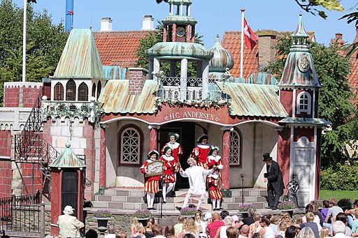
A theatrical presentation of “The Emperor’s New Clothes”, a story by Hans Christian Andersen. Photo by Danand.
There is a difference in strain on a reader’s eyes between the black on white of a printed page and the black on white of a backlit screen, with the latter being harder to take. Most books were never printed on absolutely pure white paper, and the black ink, when reflecting light, was never utterly black. Backlit screens can achieve greater contrast than print, but it’s best that they don’t because staring at very high contrast type can be a strain. The solution for screens is to lower the tone of the background, as can be seen by adjusting screen brightness or by using an application to reduce eye strain (the applications available on the market typically also change the color temperature).
A scene from The Invisible Man, a 1933 film based on a novel by H.G. Wells, directed by James Whale, with Claude Rains in the title role.
Computer users adjusting the brightness of their screens or using web applications for reducing eye strain took web designers out of the picture, however, and it appears they would have none of that. To support their design trend of using varying shades of gray text, they claimed they were enhancing legibility and reducing eye strain. There’s no evidence it does, and common sense and feedback from readers who don’t care about trends points to the opposite result. Low contrast web design is too low, and it ignores the real solution, which is not to tone down the font, but to tone down the background. Go ahead and use gray fonts on a gray background if it seems cool, silly as that is, but don’t reel off nonsensical mumbo jumbo to support that decision, and don’t expect all readers to drop to their knees and kiss the hem of those faded fonts.
— Techly
This Memorial Day marks the 150th anniversary of the holiday. When it was first formally celebrated, the holiday was a remembrance of Civil War dead and was called Decoration Day. Since 1868, Americans on Memorial Day have taken to visiting the graves of not just fallen soldiers, sailors, and marines, but those of their friends and relatives regardless of whether or not they died in military service to the country. Officially Memorial Day is for remembering and honoring the country’s war dead, but it has also become a day for remembering and honoring the near and dear, and most Americans usually do that by decorating the graves with flowers.
In western societies, placing flowers at grave sites goes back to the ancient Greeks and Romans, and even before, to the stone age, as archaeologists discovered not long ago. Since then, as Jews and Muslims have asserted their own cultural and religious preferences for honoring the dead, the tradition of remembering with flowers has remained mostly a Christian one in the west. There is an entire symbolism of flowers dating from the ancient Greek and Roman mythologists and carried on by Christians, but it’s a safe bet to guess most people pay little attention to such subtleties when picking out a specific flower or an arrangement of flowers to place at the grave of their loved one. Most likely they pick out something they themselves enjoy, or that they know was a favorite of the departed.
Common poppies blooming in May 2015 in Guelma, a district in northeastern Algeria. Photo by Yaco24.
There is one flower symbol that remains widely understood, and it is the red poppy originating from the battlefields of Flanders in World War I, which has come to specifically memorialize military members dead from service in all wars since the so-called War to End All Wars. “In Flanders Fields”, a poem written by John McCrae, a Canadian who served in the war with the rank of Lieutenant-Colonel, noted the red poppies growing among the graves of soldiers buried after the Second Battle of Ypres. The fame of McCrae’s poem established the common red poppy, Papaver rhoeas, a tough plant long known in the region as a colonizer of disturbed ground, as the Remembrance Poppy thereafter.
It is worth noting that the opium poppy,Papaver somniferum, is native to the Mediterranean region and the Near East and yields opiates such as morphine, named for Morpheus, the god of dreams. Opium poppies were well known to the ancients for their anesthetic properties, a blessed relief for those wounded in battle or near death. It’s flower is not a symbolic reminder like the red poppy of those lost to the violence of war, but its value in easing suffering and bringing on the forgetfulness of sleep to those maimed and agonized by that violence makes it more important to those poor unfortunates, and certainly more useful. Rest in peace.
— Izzy
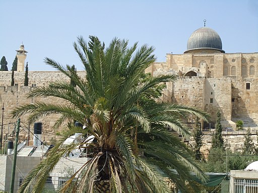
The palm fronds used for the procession of Jesus into Jerusalem on the original Palm Sunday would most likely have come from the date palm (Phoenix dactylifera). There were and are other types of palm trees in the Near East, but the date palm had the most day to day significance for the people of the area because it provided a staple food in their diet, and largely because of that the date palm also acquired symbolic significance for them. Date palm fronds were associated with peace and victory, and when Jesus rode into Jerusalem on the back of a donkey – the mount of a king on a mission of peace – the symbolism of the moment for was complete.
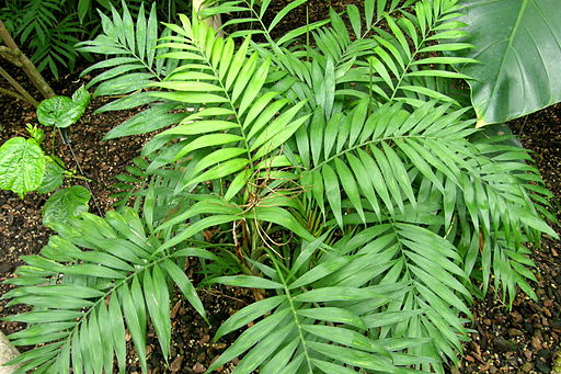
Since the first Palm Sunday, Christians around the world have celebrated with whatever plant branches were available locally without getting hung up on absolutely having to use palm fronds, which in any event were not be had in cold climates in the days before large scale international trade. It is only relatively recently that palm fronds harvested in southern Mexico and Guatemala from the parlor palm (Chamaedorea elegans) have been shipped great distances for Palm Sunday celebrations in areas where palms do not grow.
A date palm in Jerusalem, with the al-Aqsa Mosque in the background. Photo by Meg Stewart.
A parlor palm at the Berlin-Dahlem Botanical Garden and Botanical Museum in Berlin, Germany. Photo by Bachelot Pierre J-P.
Some Christians have struggled with whether harvesting fronds from wild plants in the rainforest and shipping them halfway around the world for a once a year celebration makes sense environmentally and economically. There is irony, too, in that the common name – parlor palm – for the type of plant growing in the understory of the Guatemalan rainforest tips off its other use, which is as a quite popular houseplant. People in colder climates who are determined to use palm fronds to commemorate Palm Sunday rather than any locally grown foliage could very easily grow the plant they are used to in their own parlors. Since parlor palms usually grow to four to six feet, and eight to ten feet at most, they would be much easier to accommodate in the average living room than a date palm at 75 feet, nice as it would be to have the dates at other times of year.
— Izzy