Respectfully Yours


“Where words fail, music speaks.” — Hans Christian Andersen


Divan-of-Hafiz-Binding-Gul-u-Bulbul
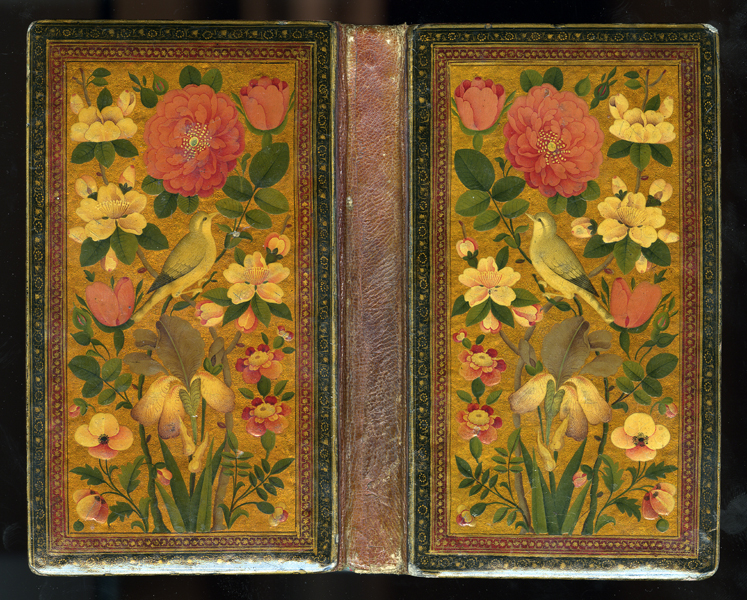
Binding of a Divan of Hafiz, from April 5, 1842 in Iran. Original lacquer “gul-u-bulbul” (flower-nightingale) motif with gold, red, and black decorative frame. The metaphorical relationship of the nightingale (active lover) and flower (passive beloved), frequently used in Persian poetry, especially by Hafiz, serves as an appropriate theme for the binding covering this manuscript.

The French musician and composer Camille Saint-SaĂ«ns wrote incidental music in 1901 for a play called Parysatis, based on a novel by the French archaeologist and explorer, Jane Dieulafoy. The play, about an ancient Persian queen and produced in 1902 for a summer festival in the southern French town of BĂ©ziers, has not stood the test of time as well as Saint-SaĂ«ns’s music.


“Le Rossignol et La Rose” is a musical piece for wordless voice in Act II. The title in English is “The Nightingale and The Rose”, and refers to Persian symbolism around love. There is a peculiar 1888 short story by Oscar Wilde titled “The Nightingale and The Rose” which is unrelated to music for the play Parysatis or to the play itself. Wilde wrote his story ostensibly for children, but its deeper themes are really beyond their understanding. Reading Wilde’s story is nonetheless instructive about love because of how he frames respect as an integral part of love.


Natalie Dessay sings “Le Rossignol et La Rose”, by Camille Saint-SaĂ«ns. Is the song sorrowful? Joyful? That probably depends on the mood of the listener. The pacing lends an air of melancholic contemplation. The song contains within it, in other words, the varied emotions of love itself. Incidentally, Ms. Dessay has sung the lead role in Igor Stravinsky’s 1914 opera Le Rossignol (The Nightingale), notably for a trippy French film adaptation in 2005 which aired on American public television. Stravinsky based his opera on an 1843 story by Hans Christian Andersen.

Without respect there is little in love beyond shallow self-interest and the words spoken sound out hollowly, like an echo. Giving respect to another is as essential as giving love, indeed is at the heart of love. Where there is little or no respect, there is little or no love, no matter the words uttered. Respect is demonstrated, is shown to another as well as to oneself. Understanding and remembering this is crucial if love is to deepen and widen beyond the initial merging of two souls, where the two converge to form a third part all its own, its own world composed of and known only to the two lovers, like two circles partially overlapping. With respect comes trust, and with trust comes the will to acknowledge fears and the courage to not run away. And then there is music, bringing love ’round full circle by singing directly to the heart and soothing fears.
— Vita   “Music fills the infinite between two souls.” — Rabindranath Tagore


“Southern Cross” a 1982 song by David Crosby, Stephen Stills, and Graham Nash.


The Emperor’s Faded Fonts


A fanciful history of web design might start with scribes in an ancient Near East civilization, all of them dutifully impressing their clay tablets deeply enough to make the characters easily legible. One day, either intentionally or because of laziness or weariness, one scribe made shallow impressions for his characters, and instead of his fellow scribes rebuking him, they hailed his genius. They were probably hipsters, who seek conformity in their nonconformity, and for whom a new look is all the more appealing if it befuddles the masses. “I can barely read it,” exclaimed one hipster scribe, “and that’s what makes it brilliant!” “It hurts my eyes,” said another who was slow to catch the new wave. After noting the disapproving looks from the other scribes, he added “I mean, it hurt my eyes until I got used to it. Now I see it’s absolutely great!”


Like the fashion world it parallels, typography must endlessly reinvent itself around a practical matter. People need to wear clothes, and when they read, they need to be able to decipher characters, whether they are impressed on clay tablets, printed on a page, or delineated by tiny dots on a backlit screen. The reasons for reinvention have much to do with evolving tastes and the need for turnover in sales, and sometimes little to do with practicality. The trend of low contrast typography in web design is a case in point. Some designers and technology companies decided about ten years ago it would be nice to have gray text on a white or gray background, and soon the nonconformists were jumping on the bandwagon and conforming. Readers seeking information from grayed out websites have been straining their eyes in frustration ever since.

Hca-paraden-kejserens-nye-klaeder
A theatrical presentation of “The Emperor’s New Clothes”, a story by Hans Christian Andersen. Photo by Danand.

There is a difference in strain on a reader’s eyes between the black on white of a printed page and the black on white of a backlit screen, with the latter being harder to take. Most books were never printed on absolutely pure white paper, and the black ink, when reflecting light, was never utterly black. Backlit screens can achieve greater contrast than print, but it’s best that they don’t because staring at very high contrast type can be a strain. The solution for screens is to lower the tone of the background, as can be seen by adjusting screen brightness or by using an application to reduce eye strain (the applications available on the market typically also change the color temperature).

A scene from The Invisible Man, a 1933 film based on a novel by H.G. Wells, directed by James Whale, with Claude Rains in the title role.

Computer users adjusting the brightness of their screens or using web applications for reducing eye strain took web designers out of the picture, however, and it appears they would have none of that. To support their design trend of using varying shades of gray text, they claimed they were enhancing legibility and reducing eye strain. There’s no evidence it does, and common sense and feedback from readers who don’t care about trends points to the opposite result. Low contrast web design is too low, and it ignores the real solution, which is not to tone down the font, but to tone down the background. Go ahead and use gray fonts on a gray background if it seems cool, silly as that is, but don’t reel off nonsensical mumbo jumbo to support that decision, and don’t expect all readers to drop to their knees and kiss the hem of those faded fonts.
— Techly


The Artist’s Rendering


“Render therefore unto Caesar the things which are Caesar’s; and unto God the things that are God’s.”
— Words of Jesus Christ quoted in Matthew 22:21, King James Version of the Bible.

Mona Lisa moustache
Leonardo da Vinci’s (1452-1519) Mona Lisa, with digitally added mustache. Derivative work by Perhelion.


This past Friday evening at a Sotheby’s art auction in London, the English graffiti artist Banksy remotely activated a shredder hidden within the frame of his painting Girl With Balloon moments after it had sold for one million British pounds. The lower half of the painting shredded, and there is some question now about the status of the sale and whether Banksy’s vandalizing of his own painting will render an even greater value for it.

Discussion of an artwork’s value outside of its aesthetic appeal is a reminder that for the rich who can afford to pay tremendous prices for art the value lies more in other, equally idiosyncratic, considerations than in its aesthetics. For the rich, art is an investment and a step on the ladder of social climbing. They may not find a particular piece they buy aesthetically appealing whatsoever. The essential thing is that enough other important people find an artwork appealing so that its value is driven up, checking off the boxes for high return on investment and an increase in high society credentials for its new owner. The artwork itself may languish in a warehouse after sale rather than go on private or public display.


The investment value of an artwork is, like money itself, largely artificial and sustained by the beliefs of the people who hold it or wish to hold it. No one can eat art, any more than they can eat money, nor can they grow food on it like they could on land, nor withdraw food from it as they might withdraw fish from the sea. It has no monetary value unless enough people believe it does. Aesthetic value, on the other hand, is almost entirely in the eye of the beholder, though some people may in their appreciation of art be too dependent on the opinions of “experts”. For an extreme case of wishful thinking brought on by peer pressure, look to the Hans Christian Andersen tale “The Emperor’s New Clothes”.

Titian - The Tribute Money - Google Art Project
The Tribute Money, a painting by Titian (1490-1576).

Before the Renaissance, art was for decoration of public spaces and the homes of the rich, and for religious instruction in places of worship since most people were illiterate and did not receive their education from books. The names of very few medieval and ancient artists have come down to us along with their works. That changed with the Renaissance, when artists such as Leonardo, Michelangelo, and Raphael acquired reputations beyond their immediate patrons among the rich and powerful. Note how we have come to know all three by single names, as if they were modern day celebrities. And it was the widening of cultural influence beyond the insularity of any one city-state’s walls during the Renaissance that allowed artists to break out of anonymity.

The international renown of a few popular artists such as Rembrandt was slow to build at first, and their artworks commanded modest prices by today’s standards. It is the international culture of today and the concentration of great wealth among an ever smaller percentage of the population that has enabled the explosion in high prices for the artworks of a relatively small number of well known artists. The last great jump in prices was roughly during the Gilded Age around the turn of the twentieth century, when a great concentration of wealth created a new aristocracy of capitalists.

In the 1941 film Citizen Kane, wealthy newspaper publisher and art collector Charles Foster Kane, modeled on tycoon William Randolph Hearst and played by Orson Welles, discusses his changing economic circumstances with his banker Mr. Thatcher, played by George Coulouris, and his longtime assistant Mr. Bernstein, played by Everett Sloane.

Now there is another concentration of wealth occurring, this time on a worldwide scale rather than limited to Europe and North America. Nothing has changed, of course: as always, the rich get richer. It’s the scale of wealth accumulation that has changed, and when artworks are selling for hundreds of millions of British pounds or American dollars, a mere million for a painting by anti-establishment artist Banksy is entry level stuff. The rich people sitting on mountains of the wealth of the world would not flinch at shredding a million pounds, and the irony of one artist’s rendering matters not at all to them as long as the artist’s growing fame increases their return on investment.
— Vita

10/8/2018 Update: Since last Friday, when Banksy’s Girl With Balloon partially shredded after being sold at auction for about ÂŁ1,000,000, its value has increased by at least 50%, and may have doubled.